
Earlier this year, we at Humanlytics interviewed more than 100 small and medium-sized businesses (SMBs) to learn about their biggest digital marketing pain points. What we found was that two recurring themes kept coming up over and over again:
1. Scarce Time/Bandwidth for Analytics: Most small business owners and marketers have very limited time and bandwidth to analyze their data. They’re too busy running their businesses. As one business owner put it, “using data is like trying to rescue a piano from a burning room — it’s nice to have but I have higher priorities.” This is because it takes a lot of time and training to turn data into actionable business insights, i.e. to answer business questions and support business decision-making.
2. Vanity Metrics Don’t Add Business Value: Vanity metrics are metrics that make you feel good about your business, but don’t actually help you make decisions (they’re not actionable). The trouble with vanity metrics is that they can actually be worse than not using analytics. They’re not only a waste of time, they can actually mislead your business decisions. Aggregate metrics like “new sessions” on your website, for instance, can obscure more than they reveal. For example, if your number of new sessions goes up, is this a good thing (getting traction with new users), or a bad thing (retention with returning users is going down)?

This is where cohort analysis comes in. The cohort analysis feature in Google Analytics is the antidote to both problems (limited time and misleading vanity metrics).
What is a cohort? In a nutshell, a cohort is simply a subset of users grouped by shared characteristics. In the context of business analytics, a cohort usually refers to a subset of users specifically segmented by acquisition date (i.e. the first time a user visits your website).
A “cohort analysis,” then, simply allows you to compare the behavior and metrics of different cohorts over time. You can then find the highest-performing (or lowest-performing) cohorts, and what factors are driving this performance.
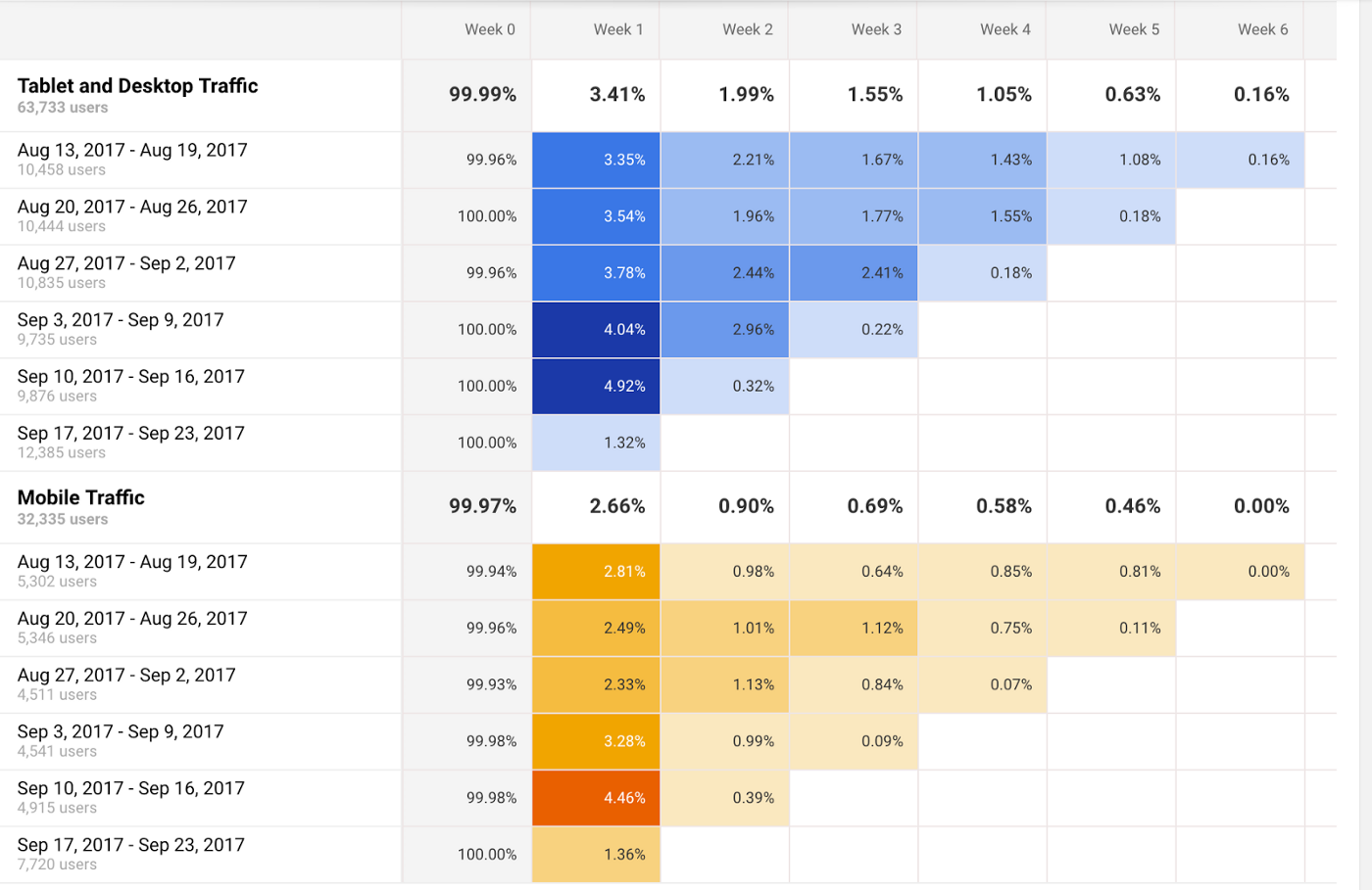
The cohort analysis report is one of the most underrated features on Google Analytics. Why? Because it helps you isolate the impact of your different marketing activities on a specific group of recipients, instead of noise in the data.
Running a cohort analysis is one of the simplest ways to run an experiment for your business. As a marketer, you can run a time-bound campaign with certain characteristics you want to test: ad content, marketing channel, target audience, landing page design, etc. You can then compare metrics for reach, engagement, and conversion for these different marketing campaign, to see which factors of the campaign actually added value to your business, and which didn’t.

This is the real value and purpose of marketing analytics in the first place. Simply put, marketing analytics tells you what is working, what is not working, and how to adjust your marketing activities based on this feedback. Cohort analysis does just that by focusing on the effect of each marketing activity or change on a specific audience in time.
As for the time scarcity issue for many businesses, going through your typical cohort analysis every week will take you less than an hour. Every business has different needs for marketing analytics. But for many businesses, if you only have the time and bandwidth to look at one Google Analytics report per week, I often recommend starting with the cohort analysis report, instead of wasting time with vanity metrics.
In this article, we’ll cover:
- What Cohort Analysis is Good For
- Limitations of Cohort Analysis in Google Analytics
- A Beginner’s Primer to the Cohort Analysis Report in Google Analytics
- A Few Examples of Cohort Analyses to Get You Started
What Cohort Analysis is Good For
As a business analytics technique, a Cohort Analysis allows you to compare variables and changes between your digital marketing campaigns.For example, like real brick-and-mortar stores, websites change. If you’re doing it right, they change a lot and often. You can use a cohort analysis to try to isolate the effect of the website modification on user behavior.
Here are some factors that can impact user behavior that you may want to analyze with a Cohort Analysis:
- Target audience
- Ad content
- Channels
- Campaigns/experiments
- Website redesigns
- New product lines and service offerings
- Sales, discounts, promotion campaigns
In web analytics, you can compare how cohorts perform in traffic metrics (e.g. returning users), engagement metrics (e.g. average session duration), or conversion metrics (e.g. sessions with transactions).
Although you can theoretically analyze any of these factors with a cohort analysis, not every analytics tool (e.g. Google Analytics) allows you to analyze the impact of all of these factors on user behavior.
Limitations of Cohort Analysis in Google Analytics
Although cohort analysis can be very useful in theory, the cohort analysis report in Google Analytics has many limitations in practice.First of all, cohorts in general can technically be grouped by any shared characteristic. However, the cohort analysis report in Google Analytics (which has been in beta for a while) can currently only define cohorts based on acquisition date (i.e. the first time a user visits your website).
Secondly, tracking retention and returning users on your website (which is what cohort analysis is often used for) is currently an imprecise exercise for Google Analytics. For example, let’s say Pete is a user on your site and visits your site today. If he visits again tomorrow, Google Analytics should register him as a returning user.
However, if Pete does any of these things, Google Analytics may not be able to properly track his next session as a returning session:
- Clearing browser cookies
- Visiting site on a different device or browser
- Visiting the site on incognito mode
The typical digital consumer now owns an average of 3.64 devices, and 36% of Americans own a smartphone, a computer, and a tablet. This inability to consistently track users across devices, browsers, and sessions is not a trivial problem.
Lastly, there’s the problem of confounding variables. As we discussed earlier, it can be helpful to overlay your cohort metrics with your marketing calendar to see how metrics change with your marketing activities.
But any association between a marketing campaign and an uptick in metrics is a correlation, not a causation. Perhaps you started that new Facebook ad campaign last Monday, but can the increase in user retention really be attributed to the quality of your Facebook ads? Or could it be that one of your older blog posts is starting to get traction?
Unless you run randomized controlled trials (RCTs) where you randomly assign users to a control group or a treatment group, you can’t definitively establish causality between a marketing campaign and the metric changes. This is especially true if you have multiple campaigns running at the same time.
That having been said, even with its limitations, the cohort analysis report in Google Analytics can still be directionally correct for data-driven decision-making, especially if you test your marketing campaigns and changes like separate experiments (e.g. if you only run Facebook ads in January, Twitter ads in February, Adwords campaigns in March, etc).
Here’s a walk-through of how to use the cohort analysis feature in Google Analytics.
A Beginner’s Primer to the Cohort Analysis Report in Google Analytics
You can find the Cohort Analysis report under Audience.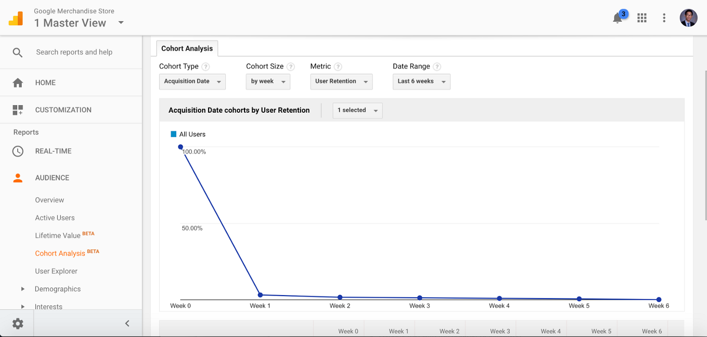
At the top of the cohort analysis report, you can adjust settings for cohort type, cohort size, metric, and date range.
- Cohort type: currently, the only option is acquisition date (the date of user’s first session)
- Cohort size: you can choose to define cohorts by day, by week, or by month. For instance, if you select by month, then each cohort represents the users acquired in a particular month (e.g. the January cohort includes all the users who had their first session in January)
- Date range: the window of time that you want to examine (e.g. the last 6 weeks)
- Metric: the data you’ll see in report. The default metric is user retention, which measures the percent of users that return.
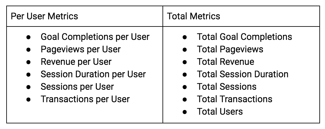
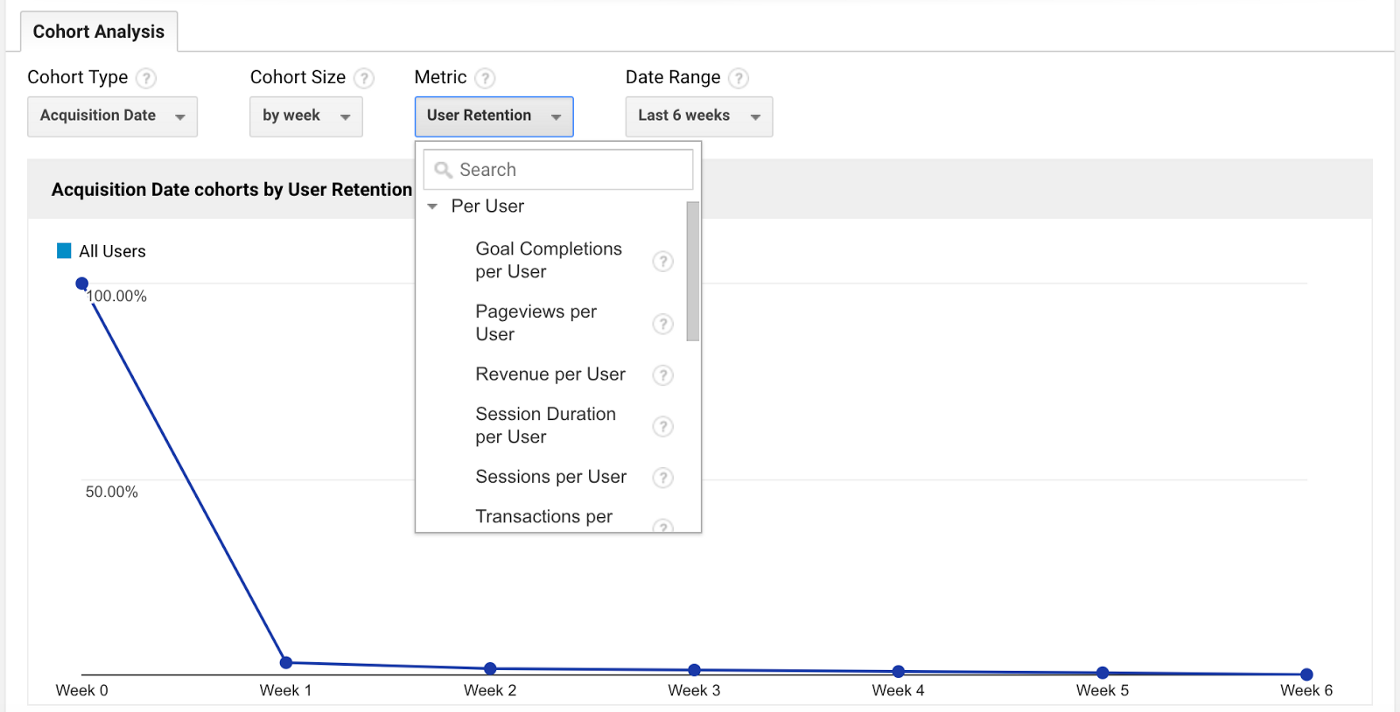
You can also choose these “per user” metrics and “total” metrics:
You can then select which cohorts to display on the graph.
You can also add additional segments (e.g. mobile/tablet traffic, etc) for comparison, just like with any other report, by clicking by clicking the plus button next to “All Users” at the top of the report. You can find our tutorial on using Google Analytics segments to analyze your audience here:
How to Use Customer Segmentation in Google Analytics to Build Your Buyer Persona
A How-To Guide on Building User Segments to Add Value to Your Business This article is part of our Google Analytics…www.humanlytics.co
However, the real meat of the cohort analysis report is the heat map right below this graph. For example, below I compare All Users with the Paid Traffic segment.
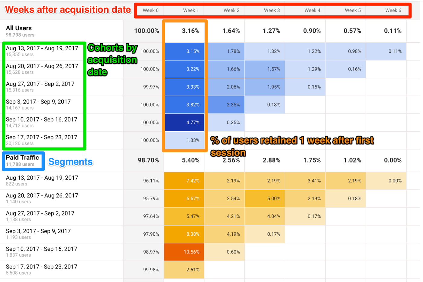
This heat map allows you to quickly identify the highest (and lowest) performing metrics by cohort and week after acquisition date. Week 0 represents the week in which that cohort’s users had their first session. This cohort heat map cannot be exported, so you may have to copy/paste or screenshot the graphic.
Let’s say that I ran a new Adwords remarketing campaign the week of 9/11 to retarget users who visited my site. As you can see in the Cohort Analysis report above, my user retention went up significantly that week. This may be evidence that my remarketing campaign is increasing user retention, which I can further explore in my Adwords report (under Acquisition).
This is why I recommend pulling up your marketing calendar in a separate window to overlay your cohort heat map with the context of your marketing activities. If you just want to track the dates of your marketing campaigns, I suggest trying the built-in Annotations feature in Google Analytics reports.
Annotations allow you to write notes for certain days in your Google Analytics reports, which can be helpful for marking when new marketing activities or campaigns begin and end. To access annotations, simply click on the down arrow tab at the bottom of the graph for a report.
If you’re looking for a more sophisticated marketing calendar platform, I suggest looking into collaborative tools such as
CoSchedule (check them out here).
Either way, looking at your Cohort Analysis report and your marketing calendar (or Google Analytics annotations) side-by-side is especially useful if you organize your marketing activities by days, weeks, or months.
For example, perhaps your content marketing team publishes new blog posts every Monday. You can see if your Monday cohorts have higher user retention (perhaps they become more engaged, sign up for a newsletter, and return to the site more often).
Or perhaps your team decides to test a different target audience or buyer persona each month for three months. You can see the differences in user retention by month in the Cohort Analysis report to see which audience is most engaged with your content or ads. You can run these kinds of experiments to test different marketing channels, campaigns, website designs, new product offerings, and promotions.
Warning: Beware of weekends when you’re doing cohort analysis by day. Many businesses will see a dip in metrics like retention on weekends compared to weekdays.
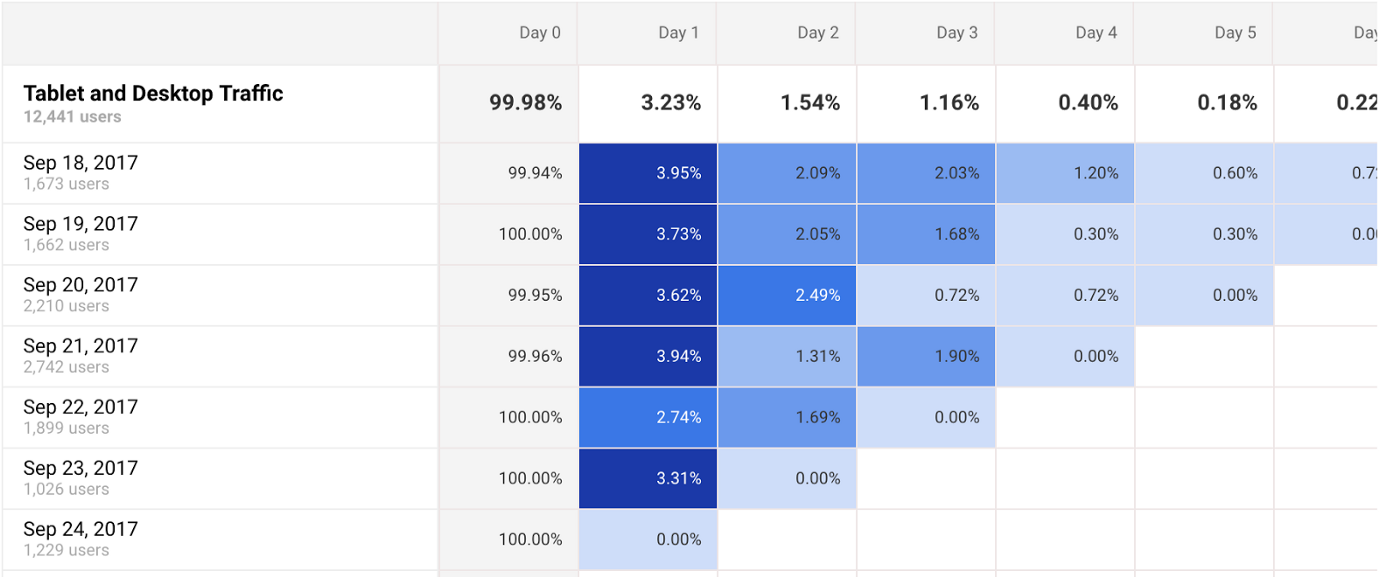
As you can see, you see a slight dip in retention for the 9/22 cohort for the Google Merchandise Store. This may be because 9/22 is a Friday, and Day 1 (which has a lower retention rate of 2.74%) is a Saturday.
A Few Examples of Cohort Analysis to Get You Started
To drill down on any cohort of interest, you can turn the cohort into a custom segment to further investigate what is driving a high-performing or high-traction cohort. Although combining segmentation analysis and cohort analysis is more advanced and requires more time to uncover insights, this is where you can really dig deeper into which factors are really driving revenue for your business over time.For example, let’s say you are a marketer for a SaaS company. You ran a Google Adwords campaign in August so your metrics went up.
At first glance, you might think to yourself, this is great, we had huge growth in our numbers, this must mean that Adwords is an excellent marketing channel for our company. We should invest more ad spend in similar campaigns.
But a cohort analysis lets you dig deeper, and may give you a different conclusion. It answers the question, “of all the users who downloaded your product in August, how many people are still engaged after 1 month, 2 months, 3 months, and so on.”
Let’s say you run a cohort analysis, and you find that for your August cohort, you see a huge dropoff after every month. There are a few possible reasons for this lack of retention. For example, here are two potential factors:
1. Mistargeting: It may indicate that your team targeted the wrong audience with your ads. Your ads drove traffic, but perhaps it wasn’t the right kind of traffic, which means this group of users download the app and then churn in the next couple of months.
2. Need to focus more on engagement: Perhaps your marketing team spent a lot of effort to get people into the software product, but not enough effort on sustaining engagement.
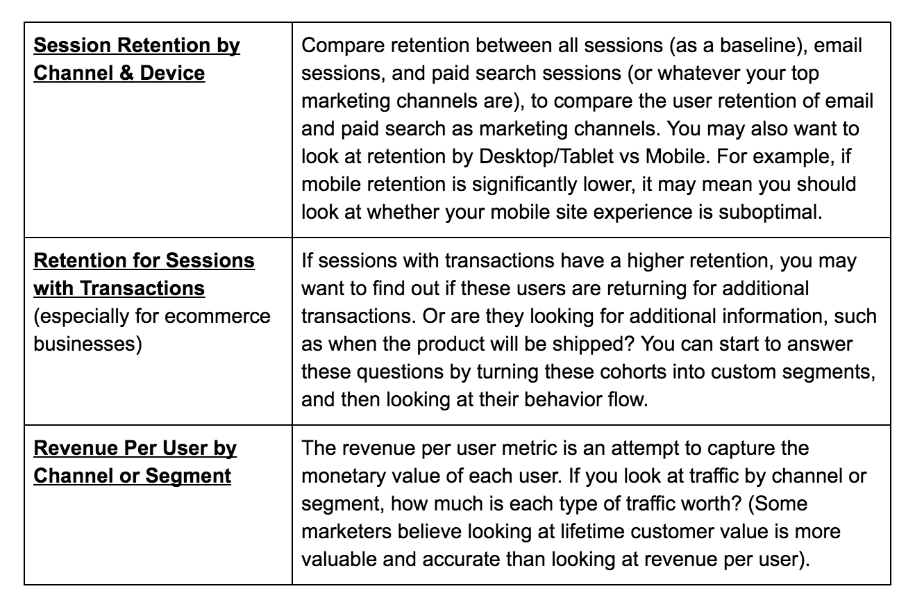
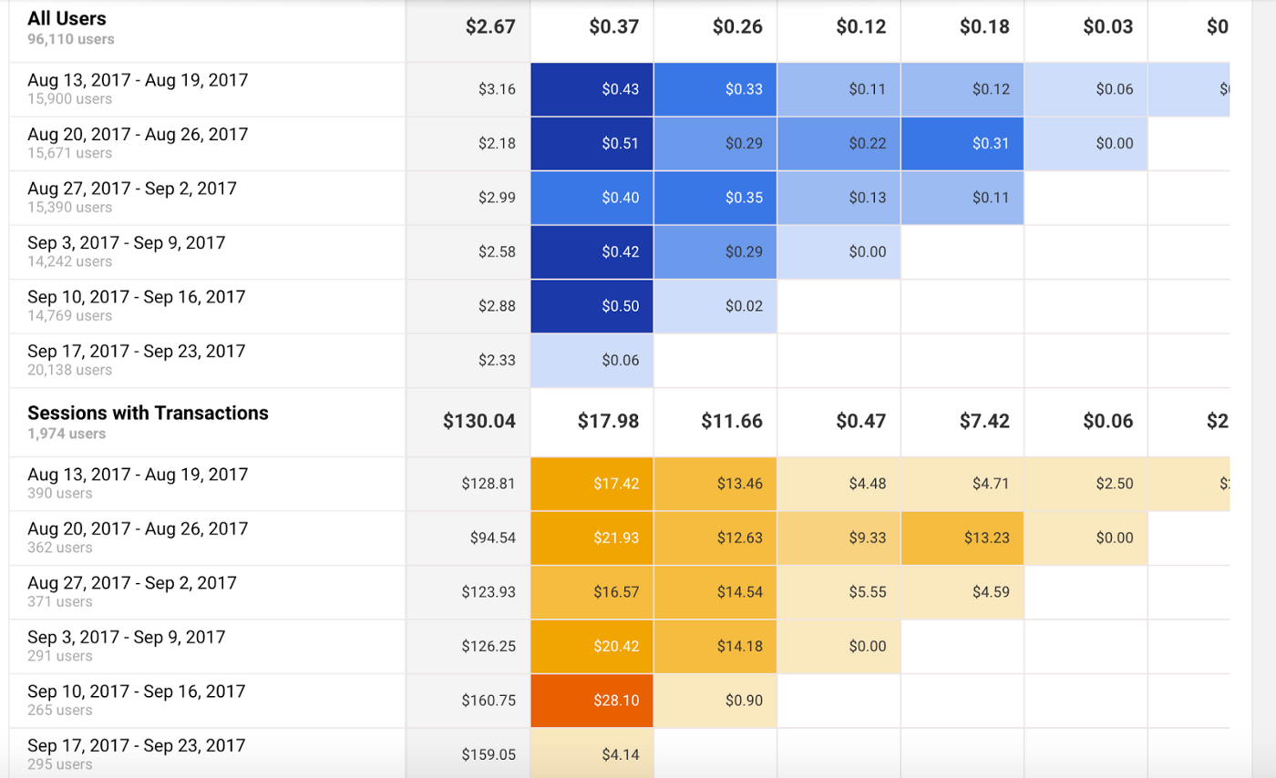
Here are a few other examples of what you can do with Cohort Analysis to get you started:
Takeaways
- Use Annotations: Start using Google Analytics Annotations or a marketing calendar to track your marketing activities and campaigns. This will help you see the impact of your marketing initiatives in Google Analytics reports, including the Cohort Analysis report.
- Test Your Marketing Activities: Start running experiments to test audiences, channels, and website design by week or by month (eg test one marketing channel per month). Schedule a half-hour one day every week to look at your Cohort Analysis report to check the results of these tests.
- Drill Down on Unusual Cohorts: If you see significant increases or decreases in metrics like user retention for a certain cohort, check your marketing calendar to identify what changes could be driving these movements in your metrics. Turn these cohorts of interest into custom segments to dig deeper into their behavior.
Next Steps
- Run new marketing campaigns like experiments. Isolate one variable you want to test with each campaign (e.g. channel, audience, ad content, etc), and stagger campaigns by week or month. Use the cohort analysis report to track the performance of each campaign.
- To read more about how cohort analysis can help you measure lifetime customer value (LCV), check out The Case for Cohort Analysis and Multi-Touch Attribution Analysis by Kissmetrics.
- Subscribe to our newsletter to receive more marketing analytics content like this: bit.ly/HMLnews
This article was produced by Humanlytics. Looking for more content just like this? Check us out on Twitter and Medium, and join our Analytics for Humans Facebook community to discuss more ideas and topics like this!